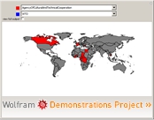
Following Andrew’s post, some of you may be interested in the interactive displays of political data available through Wolfram’s (Mathematica) Demonstration project. For example, Seth Chandler created one for my UN General Assembly data, Michael Schreiber created an interactive tool to play with EU voting power distributions, and there is one for Congressional Apportionment. There are a host of other interesting ones (the one above this post shows maps based on whether countries are members of specific international organizations). A cool teaching/research tool.


