


In 2019, the Pew Research Center produced a tidy little analysis comparing two types of survey questions. One was the “select-all-that-apply” format, where you’re presented with a list of things and choose whichever represents your attitudes or experiences. The other was the “forced choice” format, where you see the same list but are asked to provide an answer for each item, such as a yes or no.
The challenge with select-all questions is that respondents are confronted with a list of options that they have to evaluate all at once. As Pew puts it:
Responding accurately with respect to each item in the list can require a fair amount of discipline from respondents. Those lacking enough motivation may “satisfice,” or respond only in a satisfactory manner rather than in the most accurate way possible. When presented with a sizeable array of options, respondents may select only some that apply rather than all.
Indeed, the Pew analysis shows that the select-all format underestimates how often people experience different forms of victimization, compared to the forced-choice format:

A couple years later, as part of The Bitter End, our book on the 2020 election, I was hoping to analyze immigration attitudes in 2016 and 2020 using the Cooperative Election Survey. But I noticed that something had changed. In 2016, the CES gave respondents a list of immigration policies and asked them to select any that they supported. In 2020, respondents saw a similar list but had to choose whether they supported or opposed each policy. A quick-and-dirty glance suggested different responses in those two years, so we didn’t use those questions in the book.
Recently, I revisited the CES for another project and did a deeper dive. For two immigration questions that were asked consistently over 15 years, I graphed exactly what happened when the question format switched from select-all-that-apply to forced choice:
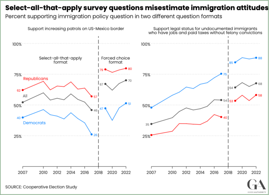
It’s the same pattern that Pew found: survey respondents are much more likely to support each policy when they are asked to choose an answer than when they must select it from the list. There’s a stark difference between 2017, the last year of the select-all format, and 2019, the first year of the forced-choice format. The percentage who endorsed more border patrols jumped from 46% to 67%. The percent who endorsed legal status for undocumented immigration jumped from 54% to 64%.
Now, there is always the question of whether this increased rate of support is the “true” estimate. Perhaps the forced-choice format is simply leading people to express attitudes that they don’t really have.
In the Pew study, they argue that the forced-choice format should not lead people to mis-report victimization experiences:
Respondents in this experiment were not expected to be susceptible to carelessly reporting potentially embarrassing or disheartening events, nor was there any social incentive to do so.
I think the same thing is true in the CES immigration questions. As the graph shows, the forced-choice format increases support for both a more conservative and a more liberal immigration policy, and it does so nearly equally among Democrats and Republicans. If people were just choosing a response at random in the forced-choice format, you wouldn’t see that pattern. Moreover, I don’t think this pattern conforms to any obvious implication of people’s tendency to give socially desirable answers to survey questions.
The risk of “select all that apply” is that people may not think through their actual opinion on each item in the list. After all, everyone takes shortcuts on surveys sometimes. Fortunately, there’s a better alternative.
Update (9/23/23): Here is a nice set of analyses of this topic conducted by YouGov.