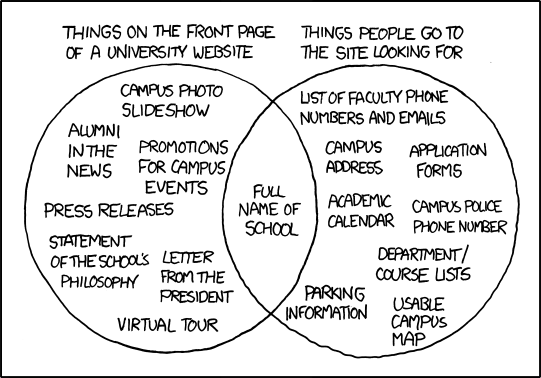
I didn’t bother linking to this cartoon when it came out a few days ago, figuring that pretty well everyone reads XKCD anyway. But “Inside Higher Ed”:http://imgs.xkcd.com/comics/university_website.png have a good article today on the background.
bq. [the] cartoon has resonated so strongly in higher ed circles that it has some marketing officials taking a hard look at what experts still believe to be their strongest marketing asset: the institutional website’s home page. … “The cartoon is right on target,” wrote Martin Ringle, CIO of Reed College, in an e-mail. “College website design typically focuses on what an institution wants to say, not necessarily what prospective students (and others) want to know. …some colleges’ home pages are saturated with features that do not so much reflect guesses at what visitors need, but what various campus interests want. Greenfield said “home page politics” — different departments and personalities jockeying for position — have a strong influence on what an institution’s site ends up looking like. After all, he said, if a president says he wants a letter and a mission statement out front, what Web administrator is going to say no?
bq. The result, said Johnson, can be an unappealingly busy website jam-packed with a lot of links included for the wrong reasons. When universities first built websites, he said, the home page would include maybe six or eight links on a toolbar; a modern site is more likely to have 15 or 20, and Johnson says he has counted as many as 32 — not because visitors want or need them, but because of “internal bragging rights.”